原健(1942~)は、色彩のグラデーションが美しいリトグラフで知られる版画家です。
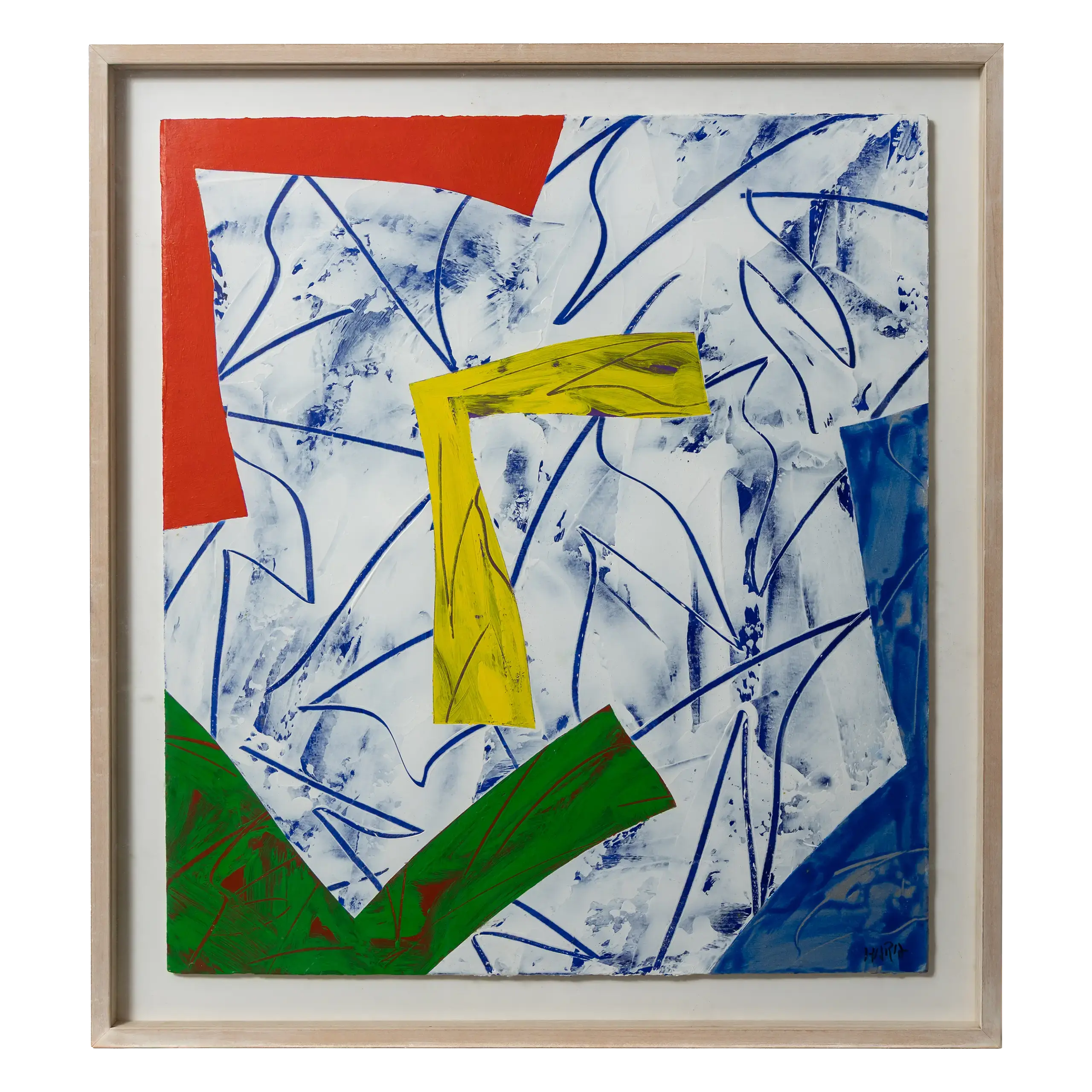
名古屋市に生まれた原は、愛知県立旭丘高等学校美術科に在籍していた頃から公募展で入選するほどの実力を備えており、卒業後は東京芸術大学絵画科油画専攻に進学しました。当初はアメリカのポップアートやハードエッジの抽象画に学んだ油彩画を制作していましたが、銅版画家の駒井哲郎(1920~1976)らによる集中講義を受けたことをきっかけにリトグラフの制作を始めます。同大学院油画専攻に進んだ1967年には初の個展を開催し、変形カンヴァスを使った【CROSS WORK】という大作を発表しました。格子柄の帯状フォルムにスプレーで銀のぼかしを入れている同作は、60年代に変形カンヴァスを取り入れていたアメリカの抽象画家、フランク・ステラ(1936~2024)の影響が窺えるとともに、平面作品でありながら、色彩のぼかしによって虚実の入り混じる非実在的空間が構築されている点は、後の作品に通じるものがあります。また、しめ縄や紙垂のような角の丸いフォルムが、この時点ですでに姿を見せている点も重要です。
1969年に同大学院を修了後、版画研究室の助手を務めながらリトグラフの制作に励んだ原は、「ローラーぼかし」という独自の技法を用いた作品を手がけていきます。第8回東京国際ビエンナーレの受賞作品【NO FOCUS 72-25.26】(1972年)は、下に黒とグレーの2色、上に赤や黄色などの5色によるグラデーションの帯が並んだ画面は、この「ローラーぼかし」の表現を決定づけるものとして高く評価されました。1975年から76年にかけて、文化庁在外研修員としてイギリスとアメリカに滞在して以降は、これまでの直線的で幾何学的なかたちが筆勢や身体の動きを表した長楕円形の弧へと変化し、鮮やかな複数の色の帯が規則的に重なりあう原の代表作「Strokes」シリーズが確立されていきました。1981年に手がけられた【Strokes 81-31】は、こうした画風が突きつめられ、洗練性を極めた作品の一つです。ローラーで薄く延ばされた均一で透明感のあるインクは、勢いを保ちながらも作家の痕跡を排し、鮮やかに引かれた色の帯は、ぼかされ重なりあうことで、複雑で奥行きのある世界観を築きあげています。
こうしてたどりついた独自の作風にしがみつくことなく、原はその後も新たな表現を模索していきました。90年代前半には、連続してつながっていた長楕円形のフォルムが個別に配置され、その背景にはドローイングされた筆跡という対照的な画面が描かれるようになります。90年代後半からは、突如として油彩によるペインティングを再開し、「飛華 ASUKA」という新シリーズを発表しました。植物や鳥をイメージさせる図形と、絵の具を引っかいて流した線描の背景が印象的な本シリーズは、やわらかで明るいイメージを持ちながら、どちらが「図」でどこが「地」なのかが判然としない、不可思議な画面で鑑賞者を吸い寄せます。近年は「Strokes」へと回帰していますが、手の動きに連動する心臓の鼓動という、身体的側面への意識が強まったことで、初期にはそぎ落とされていた生命感が作品に内包されているといった変化が見られます。創作に対する意欲と挑戦は、今もなお衰えを感じさせません。
Takeshi Hara (b. 1942) is a printmaker renowned for his lithographs featuring exquisite colour gradients. Born in Nagoya, Hara’s talent was evident early on; he was selected for public art exhibitions while still a student in the Art Department of Aichi Prefectural Asahigaoka High School. After graduating, he studied oil painting at the Tokyo University of the Arts. Initially influenced by American Pop Art and Hard-Edge abstraction, he turned his focus to lithography after attending intensive lectures by the copperplate printmaker Tetsuro Komai (1920–1976) and other masters.
In 1967, while pursuing his postgraduate degree, he held his first solo exhibition, debuting a large-scale work titled CROSS WORK that utilised a shaped canvas. This piece—featuring a grid-patterned, band-like form with silver gradations applied via spray paint—reveals the influence of American abstract painter Frank Stella (1936–2024), who pioneered the use of shaped canvases in the 1960s. Although CROSS WORK is two-dimensional, its use of colour gradients to construct a surreal space where reality and illusion intermingle foreshadowed his later trajectory. Notably, rounded forms reminiscent of shimenawa (sacred straw ropes) and shide (paper streamers) were already evident at this early stage.
After completing his graduate studies in 1969, Hara dedicated himself to lithography while serving as an assistant in the printmaking studio. It was during this time that he began developing his signature ‘roller blurring’ (roller bokashi) technique. His award-winning entry for the 8th Tokyo International Biennale, NO FOCUS 72-25.26 (1972), showcased a composition of bands in a five-colour gradient (including red and yellow) at the top, contrasted with black and grey at the bottom. This piece was highly acclaimed for defining the ‘roller blur’ style.
Following a period in the UK and the US from 1975 to 1976 as a fellow of the Agency for Cultural Affairs, his style evolved from linear, geometric forms into elongated elliptical arcs that captured the momentum of his brushstrokes and physical movement. This led to his representative ‘Strokes’ series, characterised by vivid, multi-coloured bands overlapping in regular patterns. Strokes 81-31 (1981) represents the pinnacle of this style, where his refinement reached its logical conclusion. The ink, spread thinly and evenly with a roller to create a sense of transparency, retains a sense of momentum while erasing the artist’s hand; the blurred, overlapping bands of colour construct a complex and profound world.
Never one to remain stagnant, Hara continued to explore new modes of expression. In the early 1990s, the continuous elliptical forms of his previous work began to appear as individual elements set against backgrounds of textured brushwork. Then, in the late 1990s, he made a sudden return to oil painting with a new series titled ‘Hika ASUKA’. Characterised by motifs evocative of flora and fauna set against backgrounds of scraped and dripped paint, this series possesses a soft, luminous atmosphere. Yet, it intrigues the viewer with an enigmatic composition that blurs the line between ‘figure’ and ‘ground’.
In recent years, he has returned to the ‘Strokes’ series, but with a palpable shift: a heightened awareness of the physical—the heartbeat synchronised with the movement of the hand—has infused the work with a vitality that was intentionally stripped away in his earlier period. His creative enthusiasm and restless spirit of challenge remain as vibrant as ever.